Your Wellness Website on Mobile is Either Making or Breaking Your Business (No Middle Ground)
Let’s be honest: if your wellness brand’s website looks like a digital crime scene on mobile, you don’t have a brand. You have a beautiful desktop experience that nobody is seeing.
Here’s the reality. People don’t research their sleep supplements on a laptop at their desk. They Google “magnesium for anxiety” at 10 PM while lying in bed. They click your Instagram link while standing in line at Whole Foods. They’re on their phones, and if your site doesn’t work there, they’re gone, straight to your competitor who actually designed for the real world.


This is where the AIDA model gets interesting. You’ve probably heard it: Awareness, Interest, Desire, Action. It’s how websites actually move people from “oh, this exists?” to “take my money.” But here’s what most brands miss: AIDA doesn’t work on a desktop timeline. It works on a mobile timeline, which is about 3 seconds before someone bounces.
Awareness happens everywhere, Google search, Instagram, TikTok, someone’s newsletter, word of mouth. But the moment someone clicks through, you’re on their phone. Fast load times aren’t nice-to-haves; they’re the difference between someone staying long enough to care and someone leaving because your site is sluggish. Mobile visitors have the attention span of someone waiting for their coffee order, and they will not wait for your homepage to load.

Interest is where mobile design actually shines. Clear navigation. Readable text (not microscopic). A layout that doesn’t require zooming in and sliding around like you’re solving a puzzle. Engaging content matters here, your wellness articles, product recommendations, the things that actually make someone think “okay, this person knows what they’re talking about.” On mobile, clutter kills interest faster than anything else.
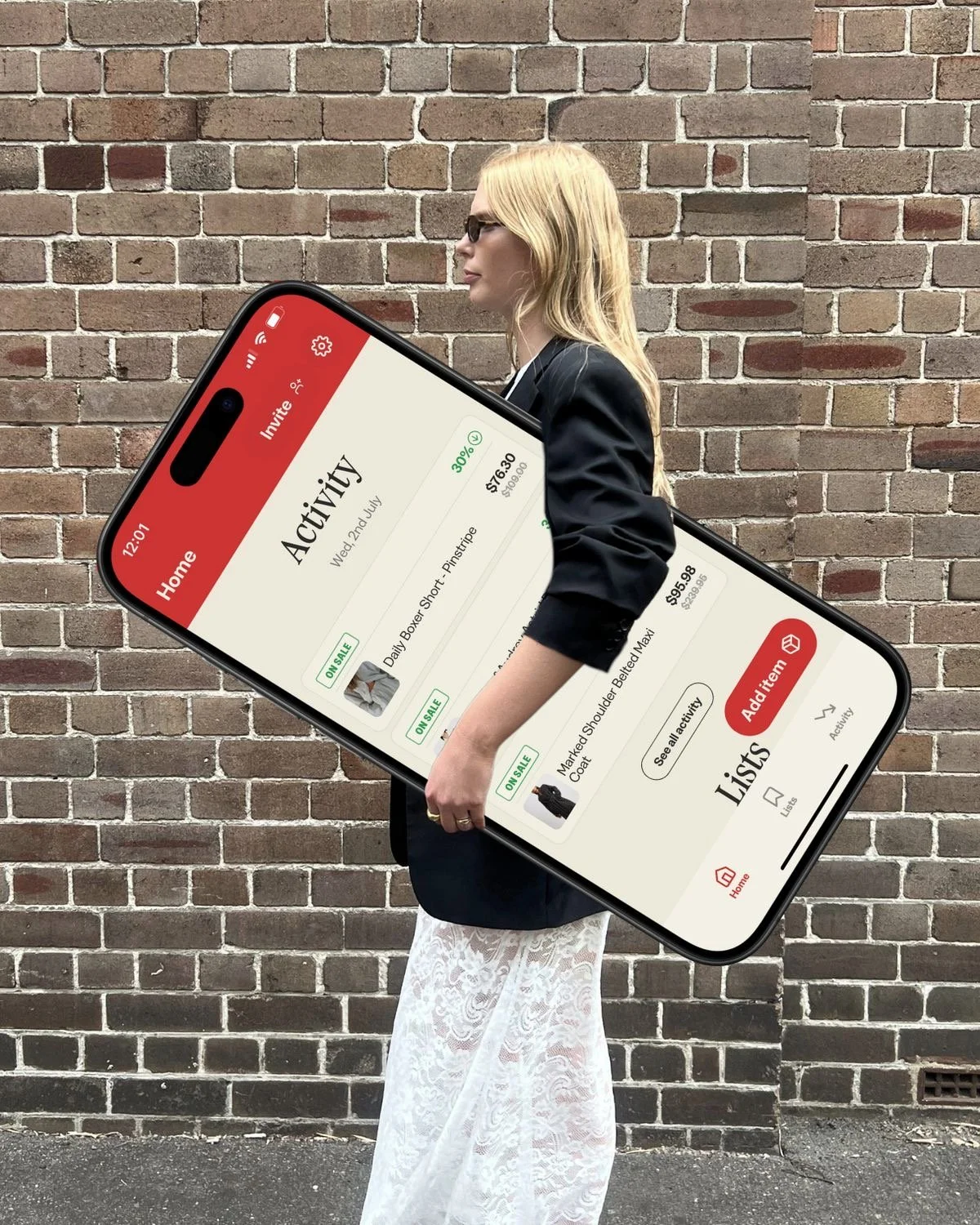

Desire happens when a visitor can actually do something. Finding your contact info shouldn’t require a treasure hunt. A “book consultation” button should be visible without scrolling through seventeen menu options. On mobile, every extra step is a reason to leave.
Action is the conversion: newsletter signup, booking, download, purchase. The thing that proves your site actually matters. And it only happens if you’ve made it ridiculously easy to do on a phone.
The unsexy truth is this: responsive design isn’t trendy or optional or something you do after the fact. It’s foundational. More people access health information on smartphones than anywhere else, and they’re making decisions about who to trust based on whether your website respects their time and their device.
Build for mobile first. Everything else follows!